📙2️⃣ Scientific Visualization Tools#
This chapter offers a broad overview of tools and libraries that support the programmatic creation of publication-quality figures. While I don’t consider myself an expert in scientific visualization, I’ve explored a variety of tools in my own research, and I hope this section provides a helpful starting point for others. Since my experience is primarily with Python, the tools discussed here are mostly Python-based. However, I’ve included links at the end of the chapter that point to similar resources for other programming environments.
Most tools are introduced only briefly, with links to more comprehensive guides. The goal is to highlight what’s possible and to help you discover tools that might suit your own research needs.
The next two sections will cover general-purpose and neuroimaging-specific visualization libraries, respectively.
📊 General Visualization Tools#
This section briefly introduces a set of Python libraries commonly used for general-purpose data visualization. These tools are widely applicable across scientific disciplines and can be used to generate high-quality plots for publications, presentations, and exploratory analysis.
Basic Plotting Libraries#
Two of the most widely used libraries for data visualization in Python are Matplotlib and Seaborn:
Matplotlib is a powerful and flexible low-level library for creating plots. It offers fine-grained control over every aspect of a figure.
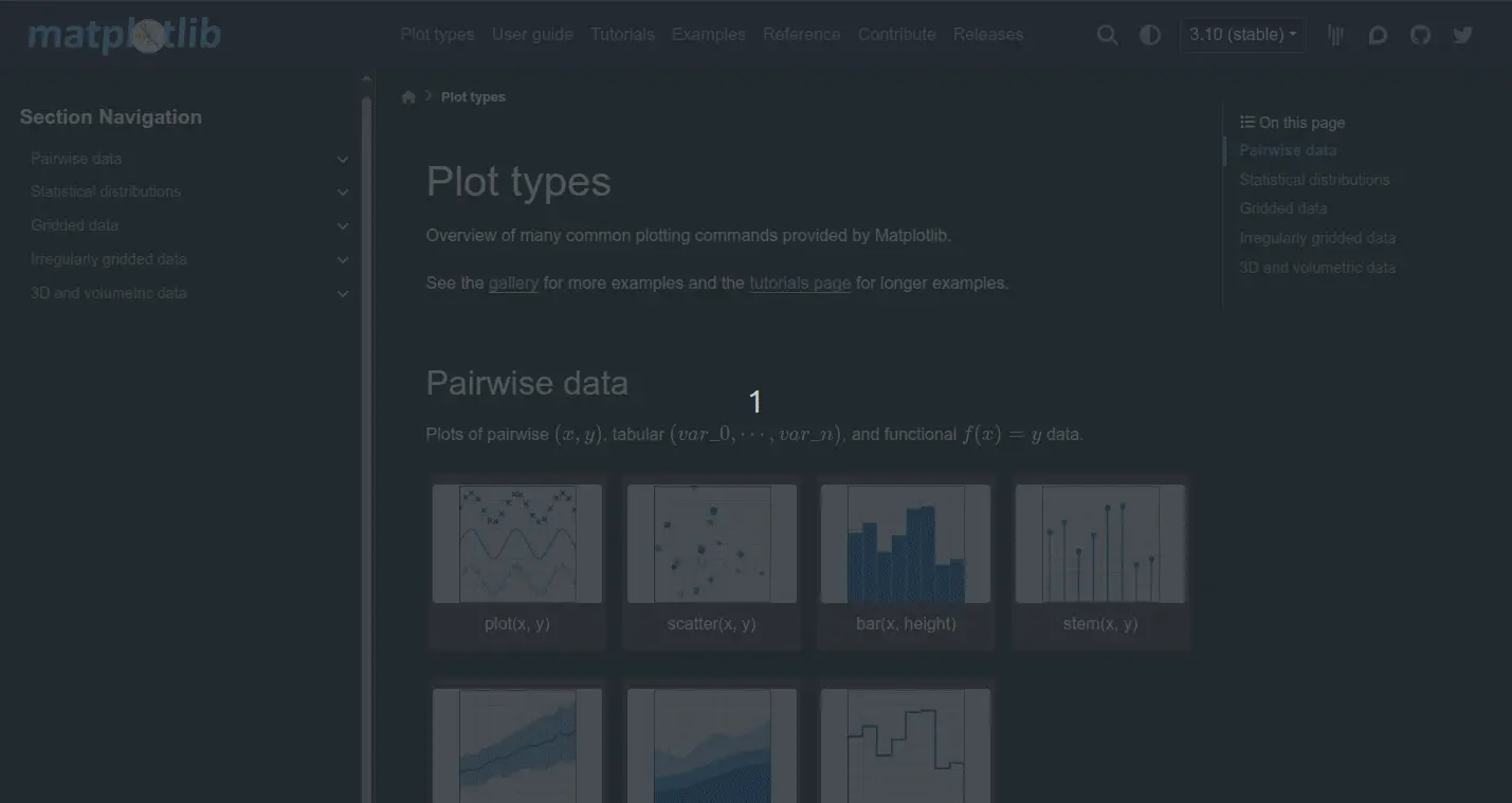
Fig. 12 A gallery of various plot types generated via Matplotlib.#
Seaborn is built on top of Matplotlib and provides a higher-level, more convenient API, particularly well-suited for statistical data visualization.
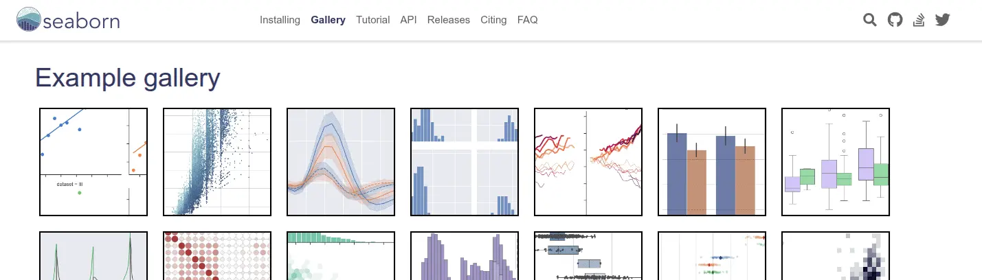
Fig. 13 A gallery of various plot types generated via Seaborn.#
These libraries support a wide range of common plot types—including line plots, scatter plots, bar plots, histograms, box plots, heatmaps, violin plots, and more—which you can explore in detail through the linked gallery pages.
Some key features worth highlighting:
✅ Multi-panel layouts: You can compose complex, multi-panel figures entirely within Matplotlib (and Seaborn), making them suitable for direct inclusion in publications.
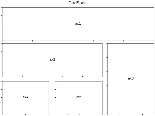
Fig. 14 Matplotlib’s Gridspec provides a flexible way to make multiple panels in a single figure.#
✅ Flexible output formats: Export figures to various formats such as PNG, PDF, SVG, and EPS.
✅ LaTeX rendering: Seamless integration with LaTeX lets you render mathematical notation directly in your plots.
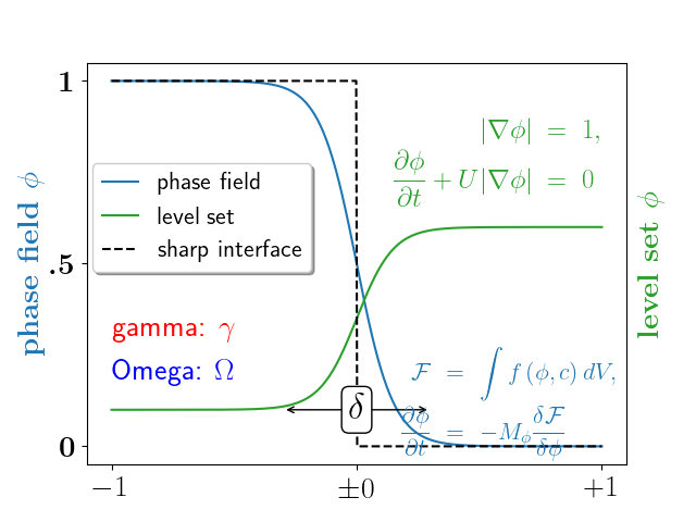
Fig. 15 Matplotlib has built-in support for latex, making it possible to integrate equations in figures.#
✅ Integration with NumPy/Pandas: Native support for working with common data structures.
We won’t cover how to write basic plotting scripts here, but links to tutorials and documentation are provided at the end of this chapter.
Supporting Data Structures#
In neuroimaging and other data-intensive fields, efficiently managing and transforming large datasets is essential. Several foundational Python libraries serve as the backbone of many visualization workflows:
NumPy: Provides fast and efficient numerical operations on arrays and matrices.
Pandas: Offers powerful data structures (like
DataFrame) for tabular data, with built-in methods for handling missing data, filtering, grouping, and more.Xarray: Designed for N-dimensional labeled arrays (e.g., time × region × subject), making it especially useful for spatiotemporal datasets and more complex data formats.
Most visualization libraries can directly accept these structures as input, making them interoperable within scientific analysis pipelines. For instance, a .csv file can be loaded into a pandas.DataFrame, which can then be passed directly to Seaborn for visualization.
Interactive Visualizations#
While static plots are great for publications, interactive visualizations are invaluable for data exploration and sharing results in dynamic formats (e.g., web dashboards, notebooks). Several libraries support building rich, interactive graphics:
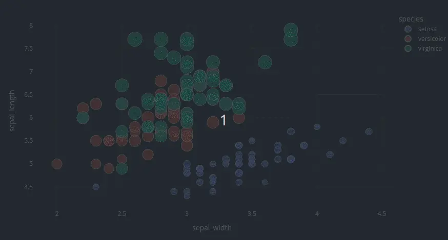
Plotly: Offers intuitive syntax for interactive plots, with features like hover info, zoom, and click events.
Fig. 16 A gallery of various plot types generated via Plotly.#
Altair: A declarative library built on the Vega-Lite grammar of graphics, great for producing concise and interactive charts.
Bokeh: Ideal for building interactive dashboards or embedding visualizations in web applications.
Panel: A versatile library for creating interactive apps and dashboards, supporting multiple plotting libraries (e.g., Bokeh, Plotly, Matplotlib, Altair) and well-suited for use in notebooks or standalone web apps.
ipywidgets: Useful for adding interactivity within Jupyter notebooks, especially when combined with Matplotlib or Plotly.
Dash: A framework (built on top of Plotly) for creating full web applications with interactive graphs and controls using pure Python.
These tools are particularly useful in designing exploratory analysis, making interactive reports, and building reproducible visualizations inside notebooks.
Visualizing Large Datasets with Shaders#
For very large datasets, such as scatter plots with many points, traditional plotting libraries can become unresponsive or fail to render efficiently. This is where GPU-accelerated, shader-based visualization becomes useful.
Datashader (by HoloViz) is specifically designed to render huge datasets by computing aggregate representations (with GPU support). Instead of plotting individual points, it computes and shades the density of data in image space, resulting in clean, informative visualizations even with billions of points.
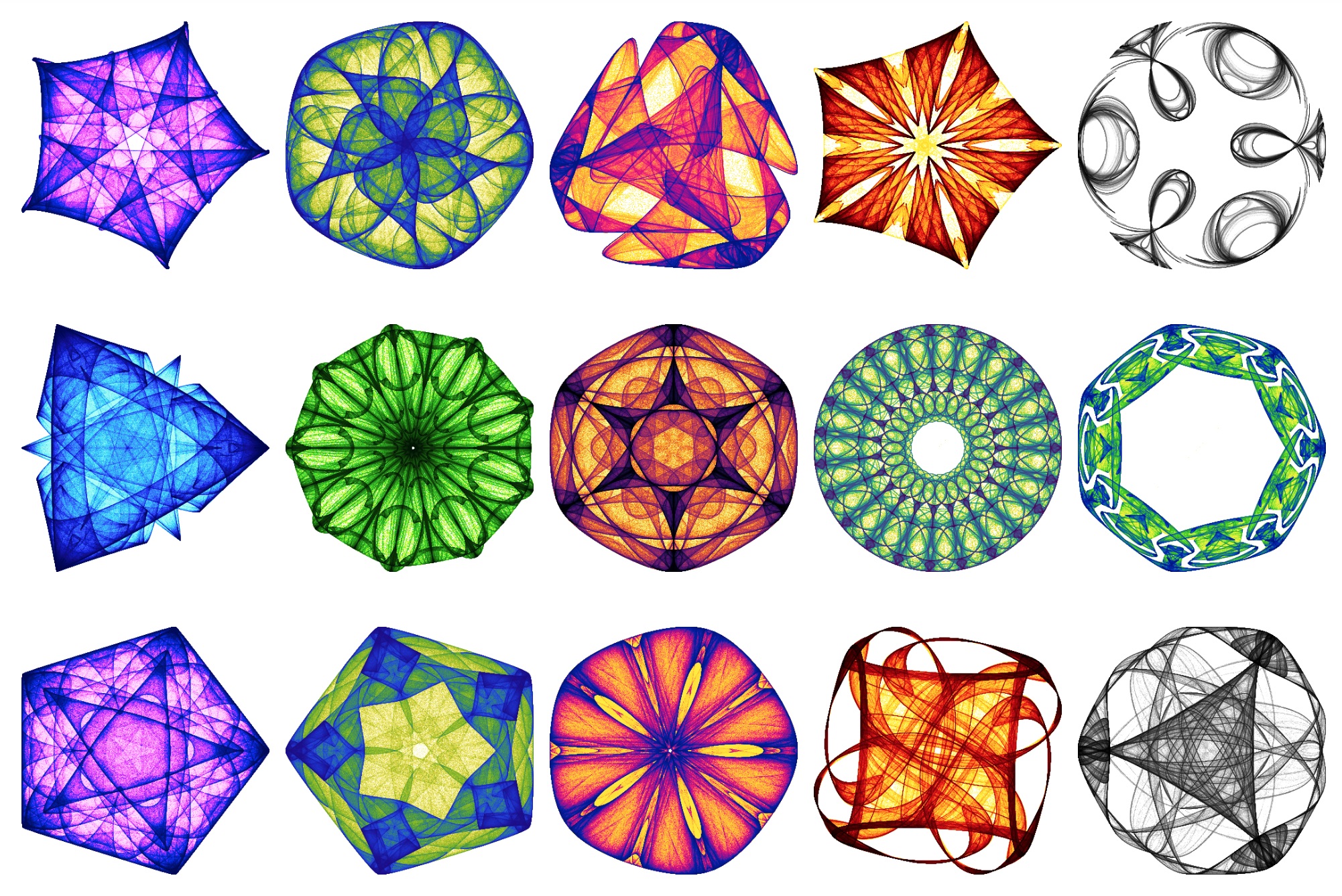
Fig. 18 Datashader can be used to visualize dynamical system attractors (with 10 million points each).#
Choosing Effective Colormaps#
Colormaps are a fundamental component of scientific visualization, shaping how patterns and contrasts in data are perceived. Poor choices can obscure structure or introduce misleading gradients.
Key considerations:
Perceptual uniformity: Changes in value should be perceived evenly across the range.
Data type: Use sequential colormaps for ordered data, diverging for values around a central reference (e.g., ± change), and categorical for discrete labels.
Matplotlib and Seaborn offer a variety of useful palettes; for instance, viridis, plasma, and cividis are perceptually uniform. For a wider range of options, the Colorcet package provides a rich set of perceptually uniform and publication-ready colormaps designed with clarity and aesthetics in mind.
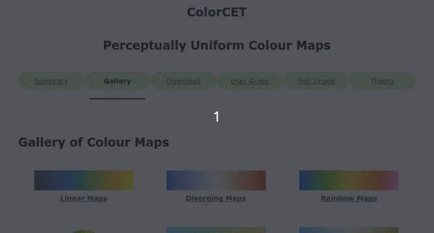
Fig. 19 The Colorcet package contains a wide array of perceptually uniform colormaps to suit different use cases.#
Using appropriate colormaps not only improves figure readability and aesthetics, but also upholds scientific integrity by avoiding unintentional distortions in the data’s visual representation.
🧠 Neuroimaging Visualization Tools#
Having introduced a suite of general-purpose data visualization tools, we now turn to software packages that are specifically tailored for neuroscience and neuroimaging. These tools are designed to handle domain-specific data formats and support visualizations that are uniquely relevant to brain imaging research.
Note
This list includes several representative tools for each visualization type, but it is by no means exhaustive. We provide links to broader, community-maintained lists at the end of the section and encourage readers to explore online, as the neuroimaging ecosystem is constantly evolving.
Handling Neuroimaging Data#
Before visualization, neuroimaging datasets must be loaded and decoded into memory. The following Python libraries provide robust support for a variety of brain imaging file formats:
Volume Slice Rendering#
A foundational form of neuroimaging visualization involves displaying anatomical or functional slices from 3D volumetric scans (e.g., T1-weighted MRI, statistical maps). These figures are ubiquitous in the literature for their clarity and ease of interpretation.
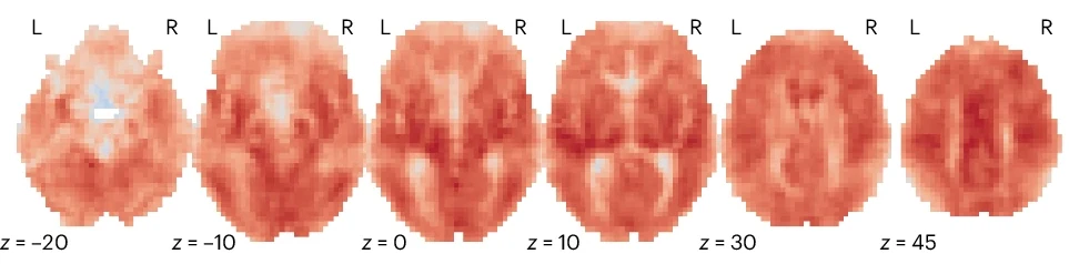
Fig. 20 An example of volume slice rendering, adapted from Bolt et al.[1].#
📦 Python tools for generating volume slice renders:
-
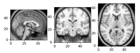
Fig. 21 NiBabel provides low-level access to volumetric data and can be used in combination with
matplotlib.pyplot.imshowto generate slice visualizations..# -
Fig. 22 Nilearn is a high-level library for statistical neuroimaging that includes built-in support for volume slice rendering and other visualization techniques.#
nanslice is a lightweight library for visualizing slices from 3D volumes.
Surface-based Visualizations#
Surface-based visualizations render cortical metrics (e.g., thickness, functional activation) on a 3D model of the cortical sheet. These projections are particularly useful for visualizing data constrained to the cortical surface, offering an intuitive, continuous view of spatial patterns that might be obscured in standard volume slice renderings.
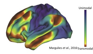
Fig. 23 An exemplary surface-based visualization depicting the principal functional gradient[2], adapted from Huntenburg et al.[3].#
📦 Python tools for generating surface-based visualizations:
-
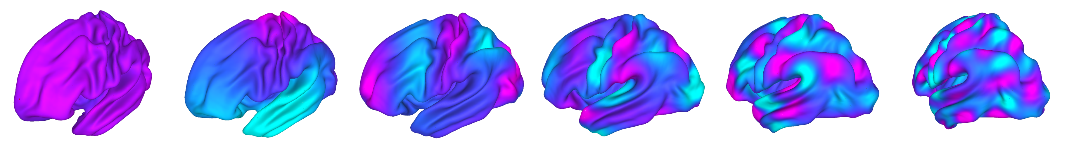
Fig. 24 A set of surface-based visualizations from Cerebro Brain Viewer.#
-
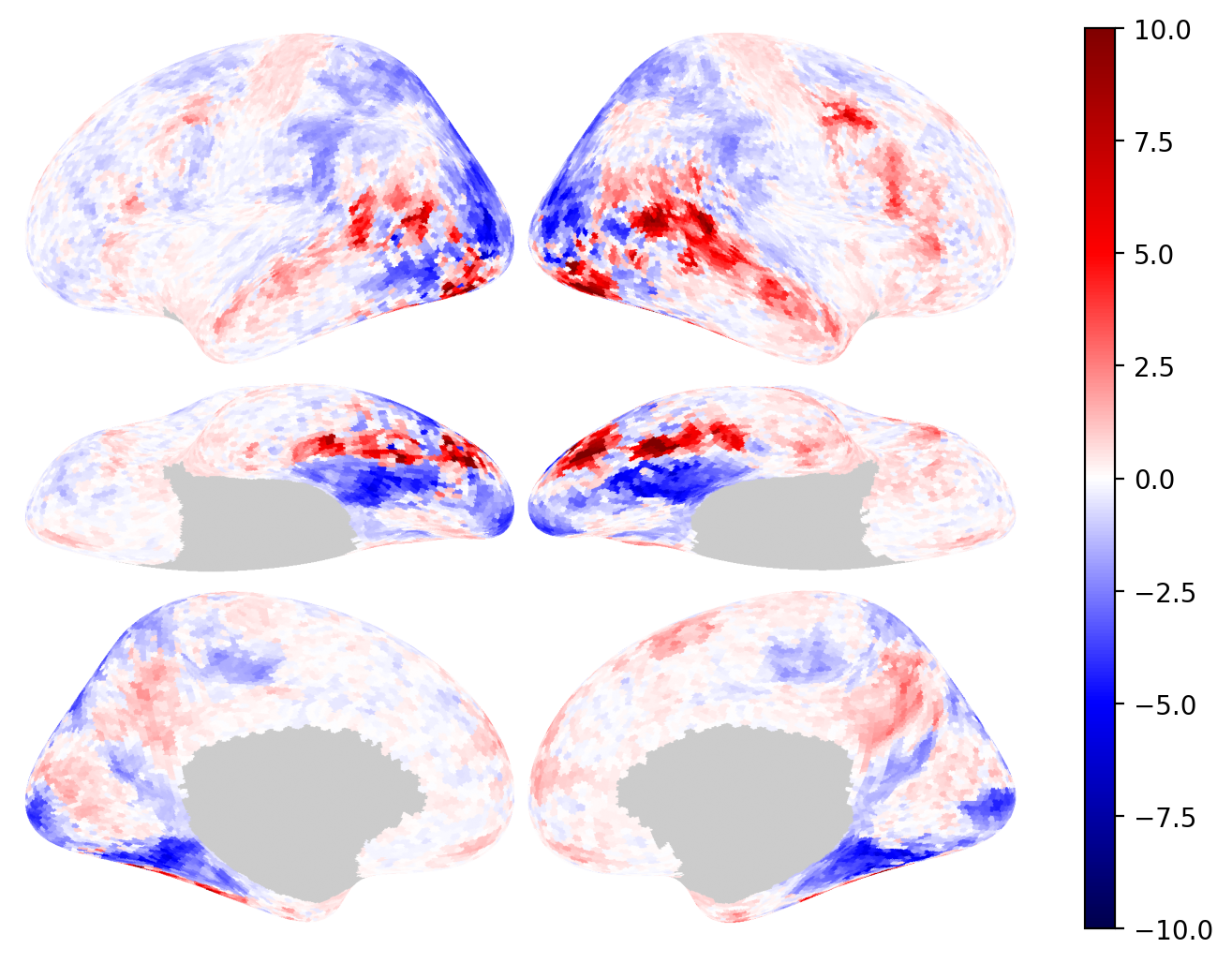
Fig. 25 An example surface-based visualizations from Brainplotlib.#
-
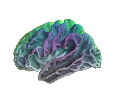
Fig. 26 An example surface-based visualizations from PySurfer.#
-
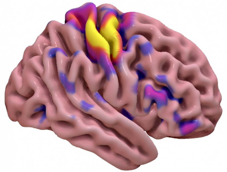
Fig. 27 An example surface-based visualizations from SurfIce.#
Volume-to-Surface Transformation#
When data originates in volumetric space (e.g., atlas-based ROIs, or a brain mask), it can be useful to project it onto the cortical surface for clearer spatial interpretation.
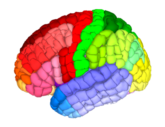
Fig. 28 An exemplary ROI to surface transformation of the Yale Brain Atlas, adapted from McGrath et al.[4].#
📦 Python tools for generating volume to surface transformations:
-
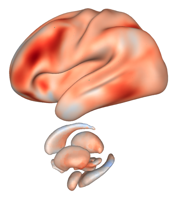
Fig. 29 An exemplary surface transformation of subcortical structures from Cerebro Brain Viewer.#
-
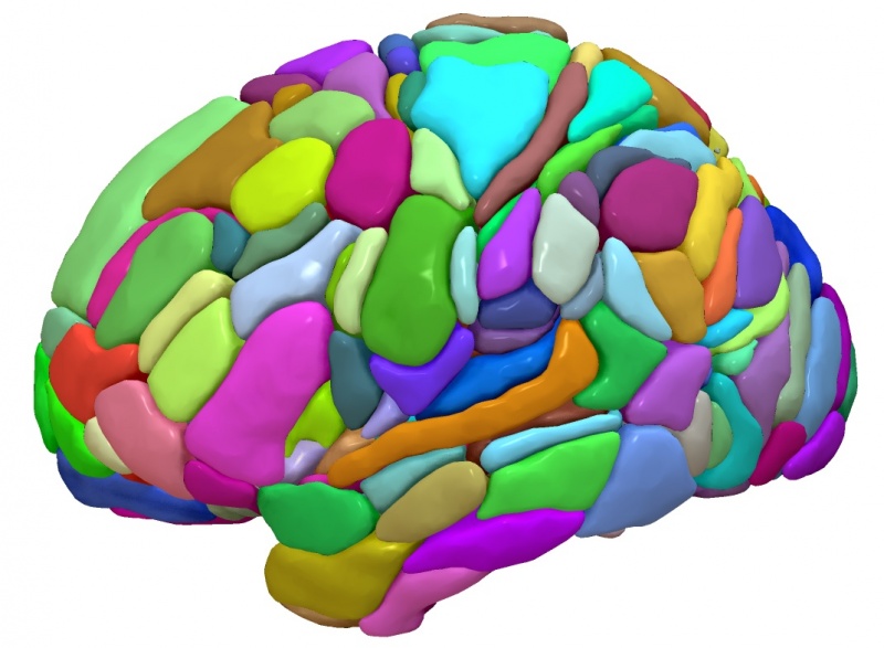
Fig. 30 An example surface-based visualizations of the AICHA template from SurfIce.#
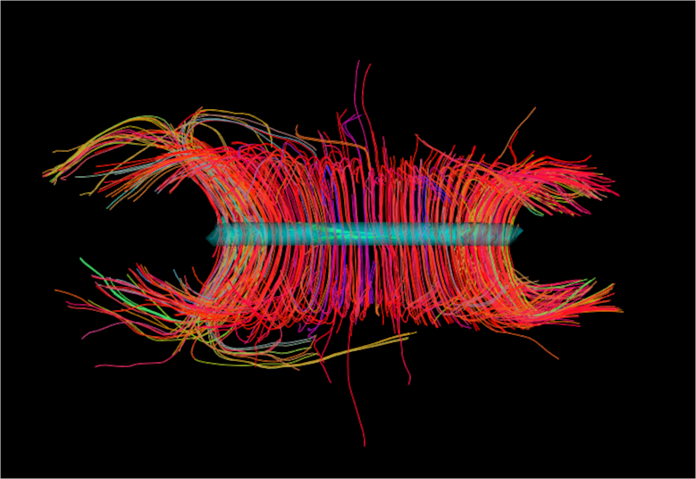
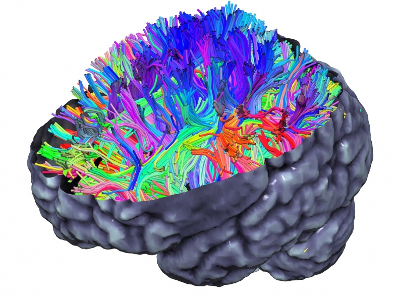
Tractography Visualization#
Visualizing white matter fiber bundles from diffusion MRI is a key part of tractography-based studies. These plots often overlay streamlines on anatomical backdrops or 3D renderings of the brain.
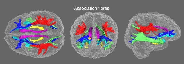
Fig. 31 An exemplary tractography visualization of the white-matter bundles, adapted from Cox et al.[5].#
📦 Python tools for tractography visualization:
Brain Network Visualizations#
Connectivity-based neuroscience research often utilizes dedicated network visualizations such as adjacency matrices (heatmaps), chord diagrams, or 3D brain network plots.
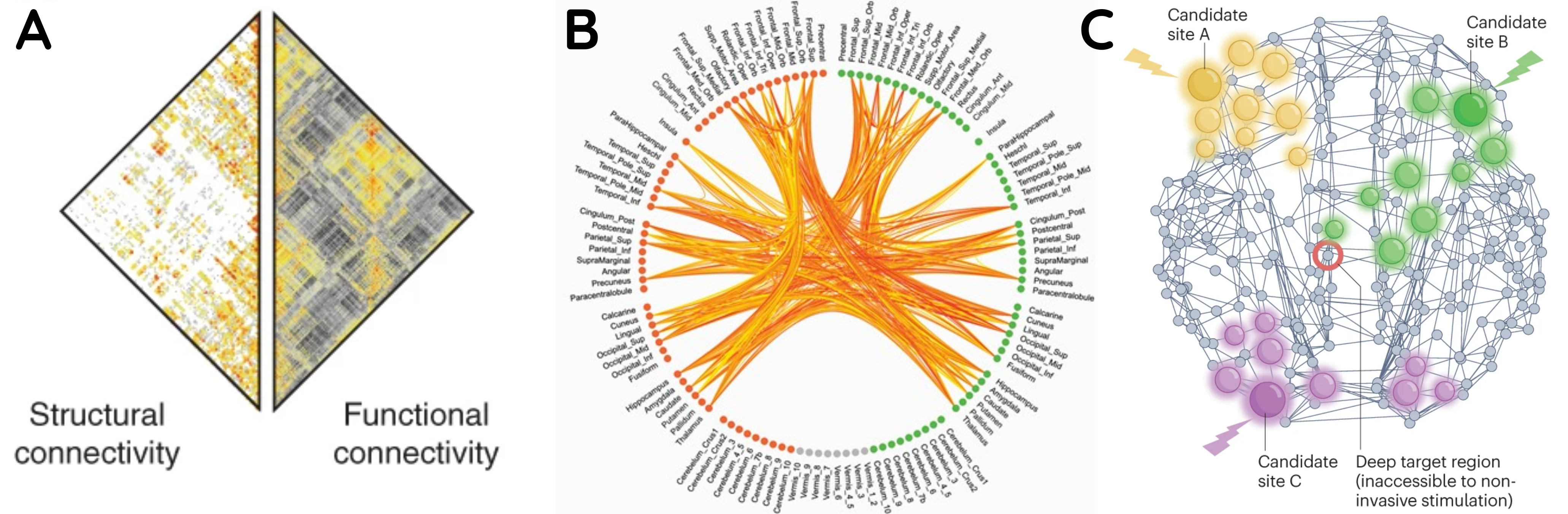
Fig. 34 Different visualizations of brain connectivity information via (A) heatmaps, adapted from Zamani Esfahlani et al.[6], (B) chord diagrams, adapted from Klauser et al.[7], and (C) network plots, adapted from Seguin et al.[8].#
📦 Python tools for brain connectivity visualization:
The following software packages can be used to produce these maps:
Heatmaps:
General purpose libraries like Matplotlib, Seaborn, and Plotly can be used to programmatically generate connectivity matrix heatmaps.
Nilearn contains functions to automate this process.
Chord diagrams:
Specific packages such as pyCircos, Chord, and OpenChord were specifically built to make chord diagrams.
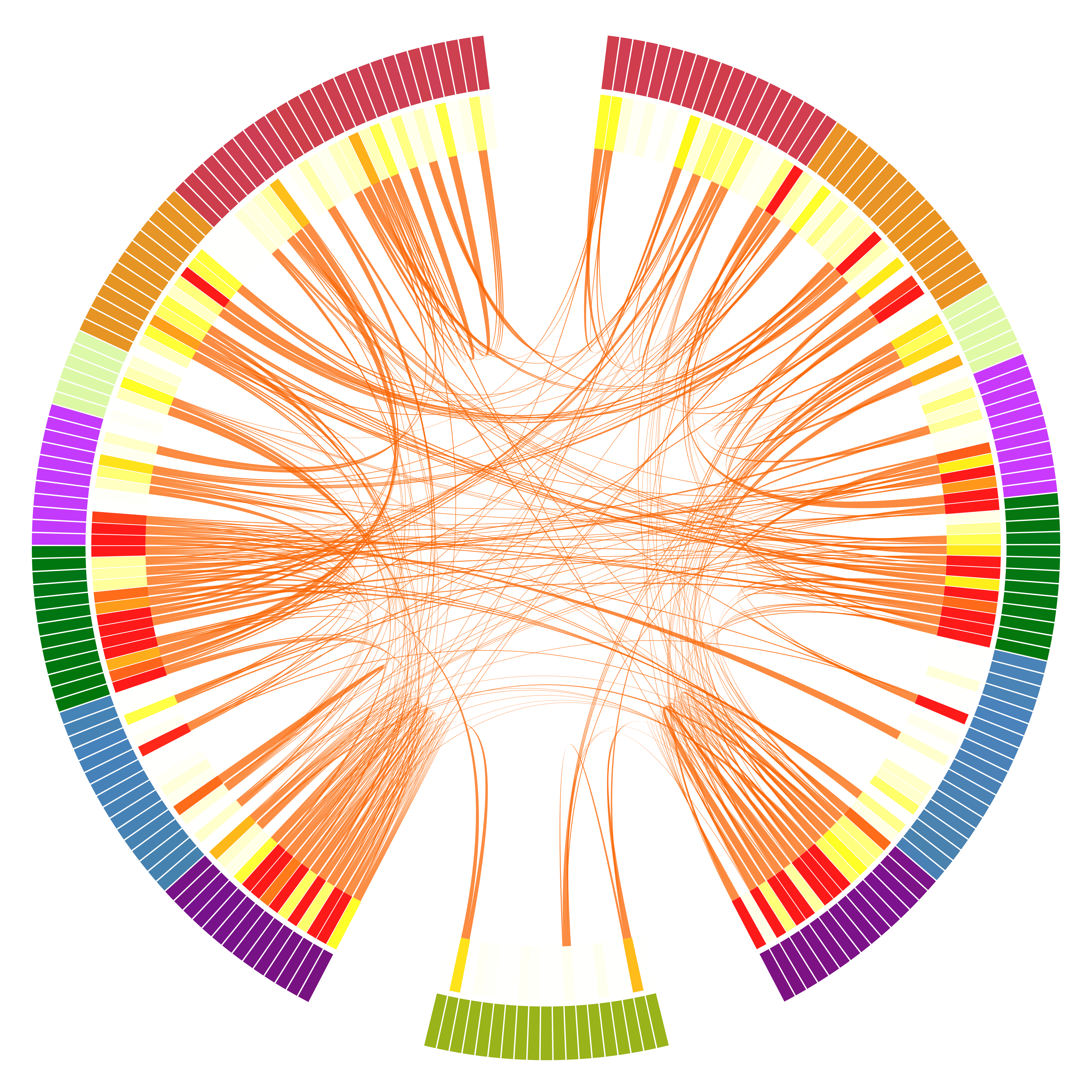
The MNE tools library also has dedicated a section on chord diagrams for connectivity.
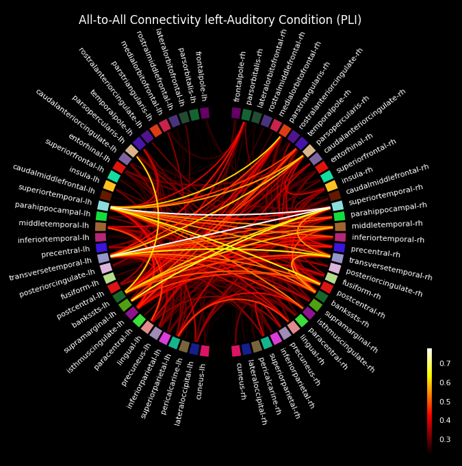
Fig. 36 An example chord diagram visualizations from MNE Connectivity.#
Brain Network visualizations:
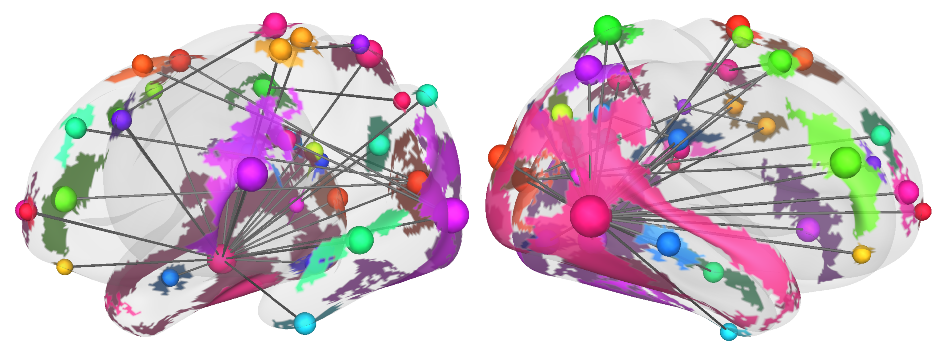
Fig. 37 A 3D brain network visualization from Cerebro Brain Viewer.#
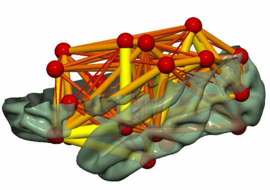
Fig. 38 An example brain network visualizations from SurfIce.#
More Complex Visualizations#
While beyond the scope of this 30-minute educational session, it should be noted that you could leverage full-fledged 3D rendering engines to create cinematic high-quality visuals and animations from neuroimaging data. For instance, you could use Python to drive visualizations in Blender, a powerful open-source graphics suite.
🎞️ For example, here is an animation created using a Python-Blender script:
The script to reproduce this figure is available here, provided for individuals interested in further diving down this rabbit hole! 🐇🕳️
💠 Supplemental Guides and Resources#
The neuroimaging community is continuously developing and curating exhaustive lists of visualization tools across multiple programming languages. As promised, below are a few recommended resources to explore further. These include methodological papers, curated galleries, and practical tools to help you go beyond the examples provided in this chapter.
📚 Key Publications#
Pernet and Madan[9]’s “Data visualization for inference in tomographic brain imaging” provides a structured guide to visualization choices for brain imaging, with helpful discussions on colormap selection and interpretability.
Chopra et al.[10]’s “A Practical Guide for Generating Reproducible and Programmatic Neuroimaging Visualizations” presents a cross-language (R, Python, MATLAB) survey of tools with a focus on reproducibility and best practices.
Chamberland et al.[11]’s “Tractography visualization” (Chapter in the Handbook of Diffusion MR Tractography) offers an in-depth look at diffusion imaging and fiber tracking visualization tools.
🛠️ Tools and Curated Resources#
Python Graph Gallery: A comprehensive collection of general-purpose visualization examples built with matplotlib, seaborn, plotly, and more.
DataCamp’s Data Visualization Cheat Sheet: A tutorial on most common general purpose visualizations and where to use them.
BrainCode A code template generator for programmatic brain visualizations in R and Python. Great for learning syntax.
NeuroHackAcademy’s Data Visualization in Python Lecture is also worth checking out.